Eastern bluebird
New maps light up information on birds
By Miyoko Chu
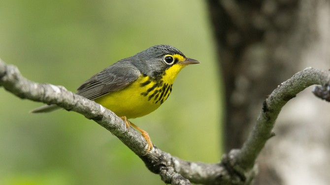
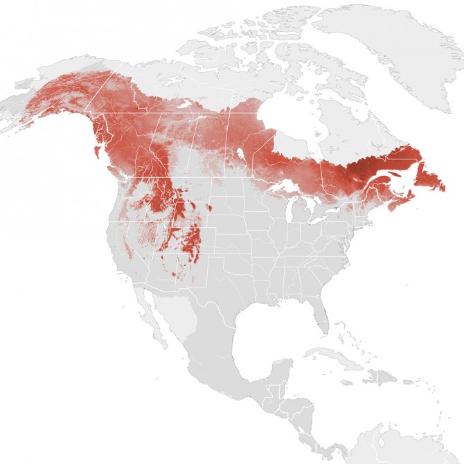
Move over, range maps. A new series of dynamic bird maps from the Cornell Lab of Ornithology reveals unprecedented details not only about where the birds are, but how their numbers and habitats change through the seasons and years.
Unlocking this wealth of information required more than 114 years of cloud computing time to process observations recorded in eBird by more than 120,000 bird watchers across North America, along with satellite imagery from NASA.
The result: a data-driven portrait of the changing movements and numbers of birds – showing the full sweep of birds across the entire continent down to your own neighborhood.
“These maps are a breakthrough. Unlike traditional maps which use a single color to show where birds are, these new maps express the rich tapestry of how bird numbers vary across the landscape every week of the year – from areas where they are rarely seen to areas with high concentrations," said Marshall Iliff, an eBird project leader.
For example, one map shows barn swallows moving north into the United States and Canada in spring. They build their mud nests on barns and other structures, raise their young, then journey back to their tropical wintering grounds. Colors show the estimated numbers of barn swallows, with yellow areas having the fewest and purple areas having the most (up to 437 swallows during a one-hour count).
From 2007 to 2016, barn swallows declined in the areas shown in red, and increased in areas shown in blue. The causes of the declines are uncertain, but scientists have implicated reduced food availability as one likely contributor. Barn swallows and other birds that eat flying insects – aerial insectivores – are among the fastest declining groups of birds in North America, according to the 2014 State of the Birds report. Use of agricultural insecticides, such as synthetic neonicotinoids, are among the chief concerns raised, given that pesticides can dramatically reduce the availability of insects the birds rely on for food.
Maps and additional data-driven visualizations for 107 bird species are free to download. More regions and species will be added each year.
The maps and the data behind them will aid land managers and scientists, helping to identify conservation needs and priorities.
“The original vision for eBird was to monitor the status and health of bird populations in near real time,” Iliff said. “Thanks to eBird participants, satellite data and new capabilities with statistical techniques and cloud computing, we’ve now realized the vision of providing a powerful way to see the linkages between birds and our ever-changing world.”
The maps and visualizations, called “eBird Status and Trends,” are made possible through support from the National Science Foundation, Wolf Creek Charitable Foundation, Leon Levy Foundation, NASA, Amazon Web Services and Cornell’s Institute for Computational Sustainability.
Miyoko Chu is senior director for communications at the Cornell Lab of Ornithology.
Media Contact
Get Cornell news delivered right to your inbox.
Subscribe


