Matching eyes to math for translucent images
By Bill Steele


Whether it’s a rare jade figurine or an ice sculpture, how light passes through a translucent surface is key to its appearance, and humans are sensitive to subtle differences in the result. So Cornell researchers, with colleagues at Harvard and MIT, are using the techniques of perceptual psychology to find out how to create realistic computer graphics of translucent materials. They have discovered that a previously overlooked bit of math is the key.
Their results were reported at the 2013 SIGGRAPH conference, July 21-25 in Anaheim, Calif., and were published in the August issue of ACM Transactions in Graphics.
Artists could use computer graphics to guide their work on real-world objects, said Kavita Bala, associate professor of computer science. “You could work with clay, scan it in and see if the real sculpture would look as gorgeous as you hoped,” she said.
To create a computer-graphic image, an artist builds a “model” – a set of coordinates that describes the shape of the object. Then the computer calculates how light rays will bounce off that object and arrive at the eye. It’s no coincidence that one of the first successful computer-animated movies was about toys; smooth plastic surfaces reflect light in a simple way.
When the surface is translucent, some light is reflected and some passes through, bouncing around for a while and then coming back out. Just how light scatters inside is what makes jade look different from ice or human skin from wax. Instead of studying the physics of light, Bala and her collaborators measured human responses to images.
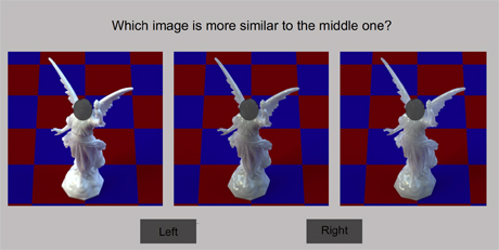
Subjects were shown three images in a row and asked to choose which of those on the ends most resembled the one in the middle. This avoids widely varying subjective descriptions and generates numerical data that can be plotted against the numbers that were fed into the computer to generate the images.
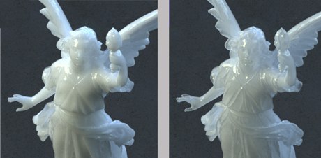
In pilot studies, the researchers learned that one crucial factor in making translucent images different from one another is the “phase function,” which determines the possible range of angles at which light going into the surface will be scattered. Previously, they noted, graphics researchers have instead ignored the phase function and used simple models of the angular scattering that miss important visual features in objects with fine details. For their tests, the researchers used images of a delicate statue.
Two different parts of the function control the diffusiveness or “milkiness” and the sharpness or “glassiness” of a computer-generated image. As Bala explains it, if you lay a block of translucent material on a page with text, glassiness is how sharp the text appears, and milkiness is how much light is held back – as if you were looking at the text through milk.
But how much indeed? By asking subjects to compare images and performing computer analysis of the results, the researchers were able to establish a scale showing how much a change in the values fed into the phase function would change the appearance of the image.
“If we can determine how similar or dissimilar different materials appear visually, we can build an intuitive interface for designers who edit and visualize materials,” Bala explained. The goal is to build software that will allow graphic artists to “turn a knob” and watch how the image changes.
Cornell graduate student Shuang Zhao is a co-author of the paper. The research is supported by the National Science Foundation, Amazon Web Services in Education and the National Institutes of Health.
Media Contact
Get Cornell news delivered right to your inbox.
Subscribe